

As the crypto market awaits Bitcoin ETF, these on-chain indicators offer a fuller picture of what to expect.
Hours away from the anticipated Bitcoin ETF, the crypto market is tense. Will Bitcoin’s price soar or plummet?
Hype dominates, expectations are high, and market greed is similar to the previous bull rally. But only cold-blooded, experienced traders prioritize hard facts over emotions.
Here is what they look at before placing an order—the list of key on-chain metrics for a realistic view of the actual situation.
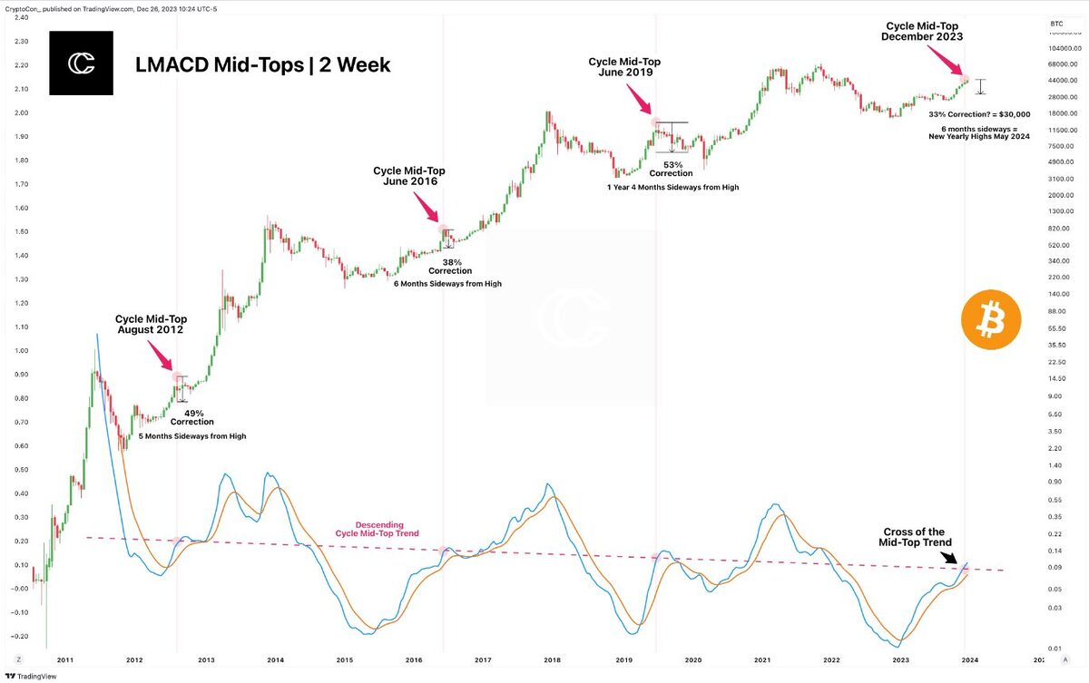
Bitcoin’s Halving Cycle
During the “halving” event, newly created Bitcoin is cut in half every four years, driving the Bitcoin Halving Cycle Theory.
According to this theory, reducing newly mined coins substantially impacts Bitcoin’s price, generating scarcity and increasing prices.
Historically, significant bull rallies followed all three Bitcoin havings (2012, 2016, and 2020), with prices hitting new all-time highs (ATH). Each year, two similar patterns repeated:
- A bullish trend started at least a year before the next halving.
- Bitcoin reached mid-cycle tops while among two all-time highs.
Sizable corrections usually follow mid-cycle tops, no smaller than 30% and sometimes even higher than 50%, like during the notorious Black Swan event in early 2020, states crypto analyst @CryptoCon.
According to his calculations, mid-cycle tops consequently ignite “a sideways period, lasting about 5 – 6 months.”
The trend is another important metric to check when identifying where Bitcoin is in its halving cycle.
Primary Bitcoin Price Trend
Like any other asset, Bitcoin’s price moves along with the trend. The primary, long-term trend represents the market’s overall direction and may last several years.
But as the major trend, it consists of the smaller movements, like secondary and minor trends. They are short-term trends and move in opposite directions than the primary trend on the smaller time frames.
Yet, as short-term may eventually break the long-term trend and have long-term implications, it is equally important to follow them.

Bitcoin price broke the short-term trend line in December 2023 yet keeps above the long-term uptrend.
As seen on the chart, Bitcoin’s price broke the short-term trendline, which it used as support for three months and turned into resistance in mid-December 2023.
Such an event usually marks a shift in market sentiment and is a sign of weakening buying interest. This eventually can lead to trend reversal.
Traders also use numerous additional indicators apart from the trendline to confirm trend reversal. Volume is one of them.
On-Chain Volume Metrics
Trading volume plays an important role in technical analysis and shows how many Bitcoins have changed hands during a specific period. High volume means more interest, while low volume suggests otherwise.
However, trading volume is not the only indicator, exposing the actual interest in a specific asset.
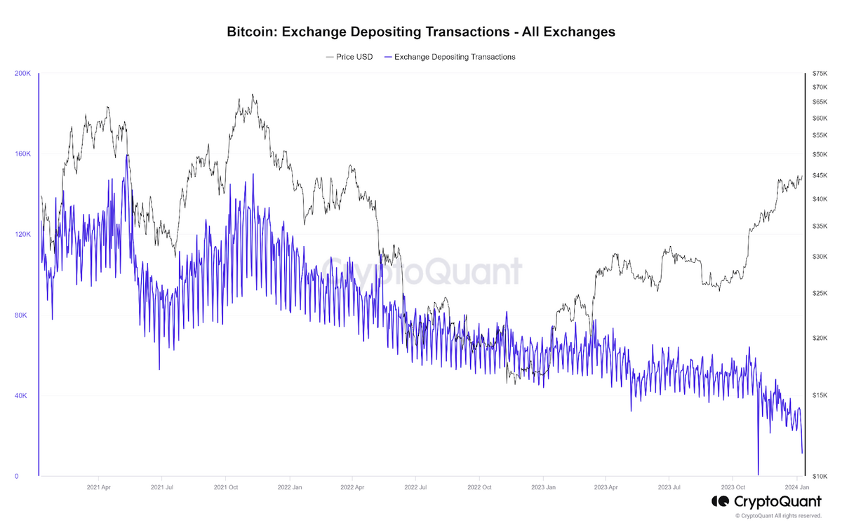
Metrics like Exchange Flows offer valuable insights into how traders tend to behave in the future.
For instance, Bitcoin’s exchange depositing transactions are at three-year lows, indicating a lower possibility of selling in the spot exchange. However, Bitcoin withdrawing transactions are also at their bottom, signaling that the number of withdrawals for long-term holdings has declined.
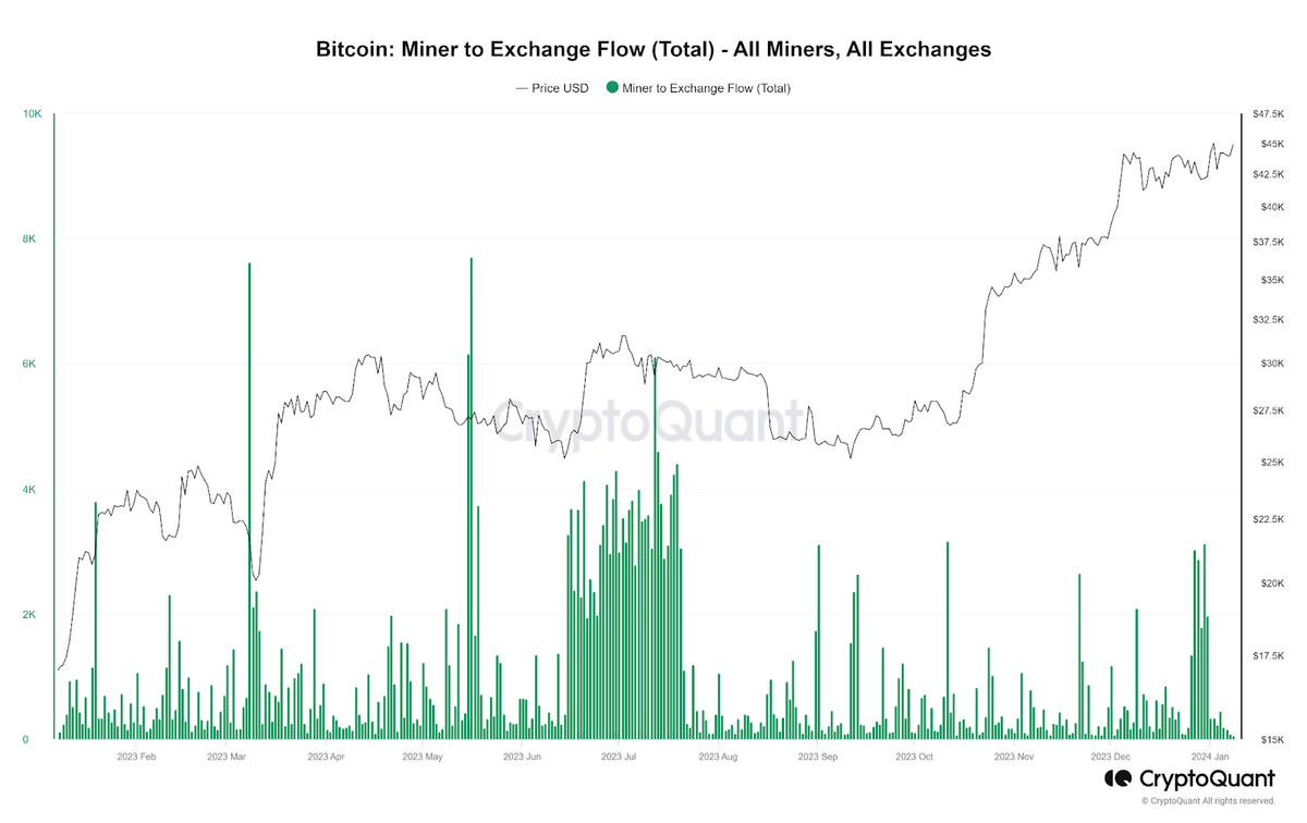
On-chain data like mining volume deposits is also an important metric to follow.
“Miners have historically been one of the largest whales, and when they deposit big amounts of BTC to exchanges, the price experiences significant downward pressure,” says blockchain analytics CryptoQuant.
As per their data, the miner-to-exchange flows spiked at the end of December, coinciding with the Bitcoin price dump. Yet the trend lasted less than a week and, at the time of publishing, seems temporal rather than lasting.
Finally, Spent Output Age Bands (SOAB) is another eloquent metric that provides insights into what kind of wallets moved Bitcoins on spot exchanges.
SOAB is a helpful tool for determining if more recent or older Bitcoins are being traded. It shows the age of the coins involved in transactions, helping to see if long-time holders or newer participants are driving market movements.
Per this metric, the biggest forces moving Bitcoin last month were extremely young coins (0-1 day), signaling that it was mostly short-term holders trading.

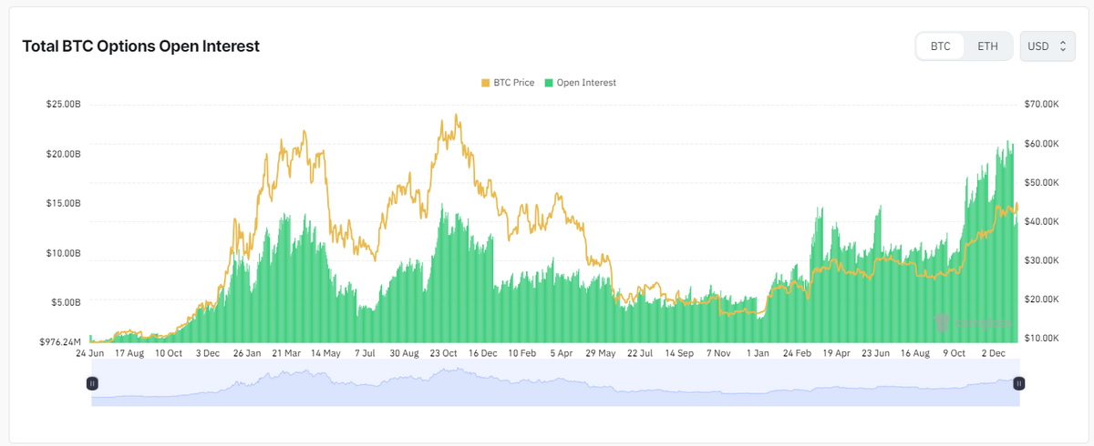
Bitcoin Derivatives and Open Interests
Contrary to Bitcoin investors, traders are playing short-term. They play the themes, like Bitcoin ETF expectations, and use leveraged derivatives – futures or options contracts – to bet on Bitcoin’s price in the future.
The total number of Bitcoin futures is called Open Interest and is an important metric that provides insights into market activity and trader interest. When open interest is higher than the set price, it suggests bullish sentiment and vice versa.
The prices of futures contracts change depending on how many traders are betting that Bitcoin price will go up (longs) or down (shorts). Optimists pay a fee (funding rate) every eight hours to maintain the BTC price close to the spot market price if there are more longs than shorts. Thus, the lack of short contracts eventually increases the prices of long futures contracts.
Given that many traders borrow funds (leverage) to increase position size and amplify potential gains, the collective impact of these leveraged positions can create enough selling pressure to push the Bitcoin price down when these traders exit the market.
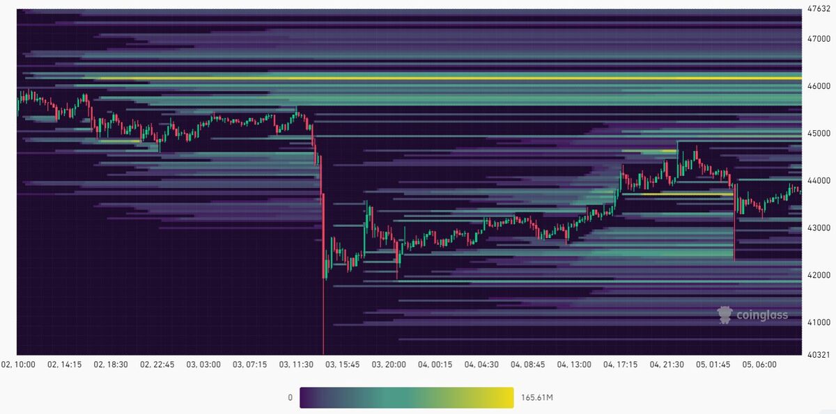
To pinpoint areas of notable liquidity, traders use liquidation heatmaps. This on-chain metric helps swiftly recognize zones on a price chart where large-scale liquidations may occur.
Differing colors indicate the intensity of liquidation events at specific price levels. Brighter colors typically represent higher concentrations and vice versa.
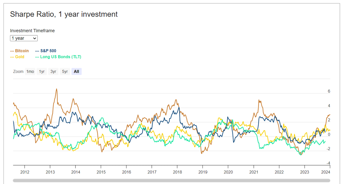
Sharpe Ratio
To assess whether the potential return is worth the level of the risk taken, traders use a metric called the Sharpe ratio.
The Sharpe ratio shows how well the asset has performed compared to its risk level. In the Bitcoin price case, it is a valuable metric to understand its broader performance across asset classes.
A higher Sharpe ratio indicates that the return from a Bitcoin investment outweighs the associated risk. Investors typically prefer assets with a ratio above 2 and avoid those below 1.
On-Chain Metrics Suggest Bitcoin Price Volatility
Data is critical when making investment decisions. The more data we have, the more comprehensive view we have of the situation, and the better informed we are.
As the approval for the Bitcoin ETF looms this week, speculations about the next moves in Bitcoin’s price intensify.
However, a closer look at on-chain data — considering trends, exchange flows, Bitcoin derivatives’ open interest, and its position in the halving cycle — suggests a likelihood of increased volatility. It underscores reasons for caution, particularly in the short term.


